A long-time resident of Italy, Mika Hosokawa works as a graphic designer, illustrator and calligraphic artist.
Her original style is vector illustration, today's modern stylus, but since she has been in Japan she has designed various logos for sushi restaurants and CD cover titles for enka (folk and traditional music) singers.
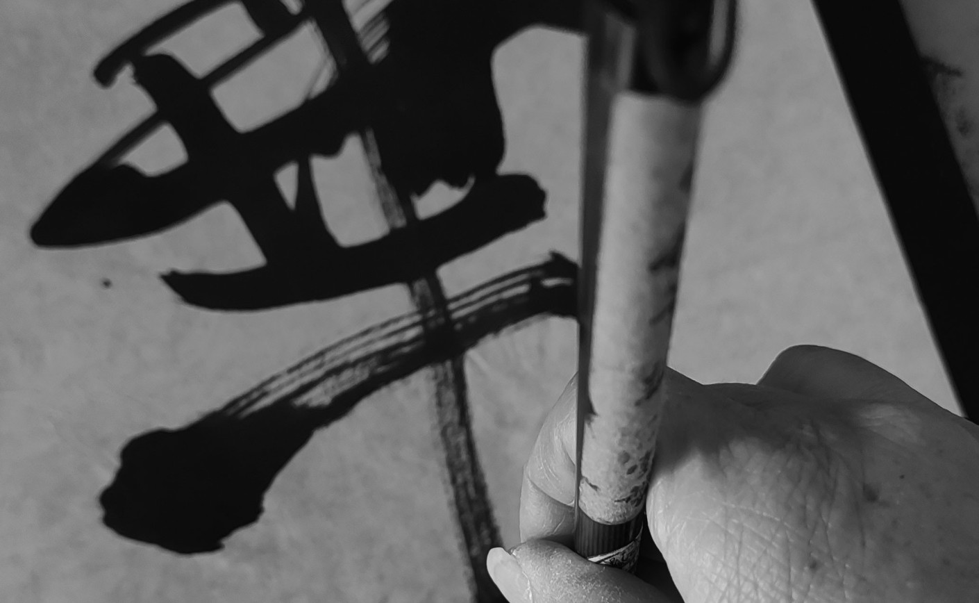
She is often commissioned to draw characters similar to Japanese calligraphy with a brush not a PC mouse. ‘the characters written by the calligrapher are too neat and uninteresting, instead her characters I feel the energy, something more from the letters.’ this is how her clients appreciated it.
In fact, one of her customers, a sushi restaurant in Hokkaido has been using the logo she designed for 30 years.
‘Kanji, Japanese ideograms, each have their own meaning. For example, my name Mika is made up of two kanji: my parents wanted me 美 to be beautiful and 華 to be gorgeous.
The name Mika also varies depending on the kanji used. For example, other Mika 美香 means beautiful(美) fragrance(香).
Mika 美佳 for a balanced and beautiful person.
Mika 美花 for being like a beautiful flower.... Kanji can have connotations that cannot be expressed by the sound of the mika alone. I ponder the meaning of each kanji character in my mind and draw rather than write the calligraphy in one go with black ink on Japanese paper. This is my style. I would say artistic calligraphy’
‘In Japan they say every word has a soul and power.
When I draw, how I put life above each letter.’
He chooses proverbs from Eastern life philosophies that colour our daily lives, filtered through his almond eyes and the result is a unique mix of calligraphy artistic